File Manager navigation improvement
Posted: 25 Aug 2025, 16:20
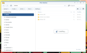
I’m coming from Synology, and with their DSM, the file manager is organized by shared folders rather than volumes. To be honest, I don’t want to scratch my head thinking, “On which volume is my shared folder located? Should I click Volume 1, 2, or 3 first?”
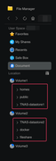
Could you enhance the file browser to do what its name suggests: it’s a file browser, not a volume browser. To make it smarter, please refer to the picture: I expect both red blocks to be visible without needing to click the volume information first. I’m there to browse files and data.
Could you enhance the file browser to do what its name suggests: it’s a file browser, not a volume browser. To make it smarter, please refer to the picture: I expect both red blocks to be visible without needing to click the volume information first. I’m there to browse files and data.